Brand
Brand Guidelines
Welcome to the REWBI brand. This is a quick look at the logo, color, and type that make us recognizable, and how to use them well wherever the institute shows up.
01 · The Logo
The skyline mark & wordmark
Use the horizontal lockup by default. Reach for the vertical lockup only when width is limited, like avatars, signage, and centered layouts.
02 · Construction
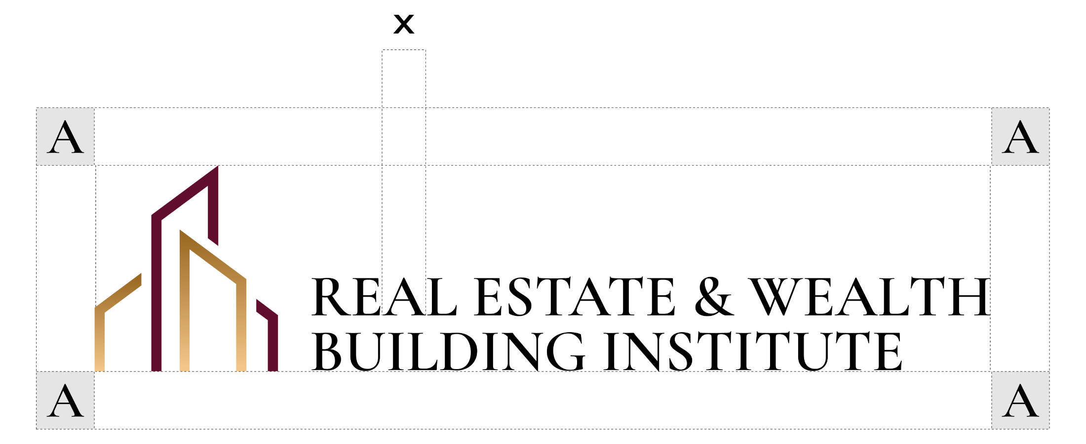
Four numbers hold it together
Proportions are baked into the artwork — never rebuild or re-space it. Remember these four numbers and you can check any layout at a glance.
- 2.2 : 1 Icon to wordmark A : C height ratio — fixed
- 25px Icon–wordmark gap B at reference size (A = 154px) — scales with the logo
- 1 A Clear space One icon-height square, on every side
- 25px Minimum height On screen · at least 0.5in wide in print
Minimum size
- On screen, keep the horizontal lockup at least 25px tall.
- In print, keep it at least 0.5in (13mm) wide.
- Below those sizes, switch to the mark on its own instead of shrinking the lockup.
03 · Backgrounds
One logo, six backgrounds
Use the version with the most contrast on your background. Don’t recolor the default to fit; there’s a cut for each surface.
04 · Color
Burgundy and gold
A small, deliberate palette. Burgundy is primary, gold is the accent, and neutrals carry text and surfaces. Click a swatch to copy the hex.
Burgundy
Gold
Neutrals
05 · Typography
Serif headlines, sans for everything else
Two typefaces. Cormorant Garamond for headlines, Inter for everything else. The logo is custom artwork, so don’t retype the name.
Aa
Aa
06 · Assets
Download the logo files
Files come straight from the brand repo on GitHub, where you’ll also find PNGs, other sizes, and the editable source.
Explore additional sizes, formats, and editable source files in the REWBI brand repository on GitHub.
Open the brand repo (opens in new window)07 · Usage
Dos and don’ts
Follow these to keep the logo consistent everywhere it appears.
Do
- Give the logo clear space on every side.
- Use the treatment that fits the background.
- Scale it up when it looks cramped.
- Keep gold as a gradient wherever it renders.
Don’t
- Recolor the mark or change the gold to an off-brand tone.
- Stretch, condense, rotate, or rebuild it.
- Retype the name in another font.
- Place it on a busy or low-contrast background.
08 · Naming
How to write the name
Write the name the same way everywhere.